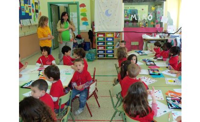 El EXCMO. Ayuntamiento de Polop de la Marina ha
financiado 350 camisetas de color azul, verde, amarillo, naranja. Para los talleres de los alumnos y profesores del Colegio Público San Roque de Polop.
Hemeroteca
Arrendamiento bar cafetería del castillo
Obras de mejora de la red de agua en el casco antiguo
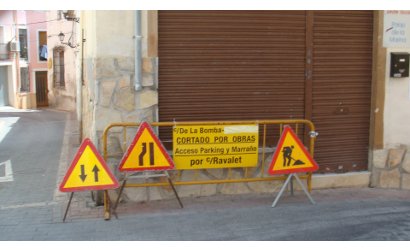 Hoy Lunes 11 de Abril, comienzan las obras de mejora de la red de agua en la calle La Bomba del casco antiguo de Polop de la Marina.
Viaje «Espacios Mayores 2011»
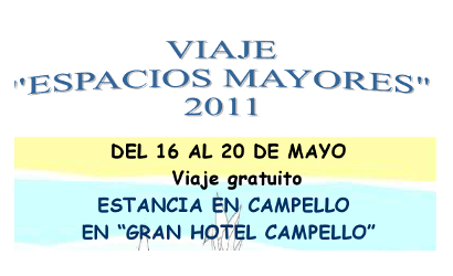 El Ayuntamiento de Polop de la Marina, organiza un viaje gratuíto a Campello para personas jubiladas o prejubiladas.
Presentación del Proyecto Ciudades Seguras Digitales
 El pasado Martes 29 Marzo, la Comisión Comarcal de Prevención en Seguridad Local y Primeria Consulting, organizaron la I Jornada Tecnológica para presentar el proyecto Ciudades Seguras.Digitales.
Citación
La visión de los niños: el ojo vago
 El Ayto de Polop de la Marina, organiza para el Miércoles 30 de Mayo una charla coloquio impartida por el profesor Dr Carlos Laria Ochaita director de Oftalmología pediátrica y estrabismos de oftalmar en el Hospital Internacional Medimar de Alicante.
Subvenciones
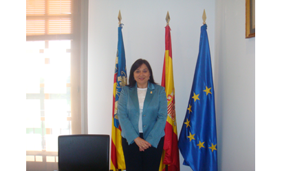
 La Alcaldesa de Polop de la Marina, Mª Dolores
Zaragoza Teuler, informa de las ayudas que ha
concedido el Excmo. Ayuntamiento en el ejercicio
2010 – hasta el 29-03-2011.
Plan Territorial de Emergencias
Visita del Presidente de la Diputación a Polop de la Marina
 El gabinete de prensa de Polop de la Marina, pone en su conocimiento, la visita al municipio de Polop, del presidente de la Excma. Diputación de Alicante, Jose Joaquín Ripoll Serrano para el próximo Miércoles 16 de Marzo a las 10:45 A.M.
El impuesto de basuras, no subirá este año 2011, en el municipio de Polop de la Marina
 El Equipo de Gobierno Popular, ante la crisis que estamos atravesando a nivel Nacional, ha decidido no incrementar el Impuesto de Basuras en el Municipio.
III Open BTT Polop de la Marina
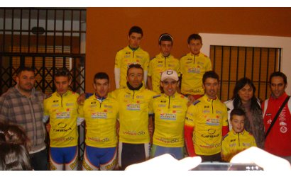 El pasado Sábado 5 de Marzo, la alcaldesa de Polop de la Marina, concejales, policías, servicios técnicos del Ayuntamiento y protección civil, en su política de apoyo al deporte, acompañaron, y participaron en el III Open BTT en el circuito de Chirles, organizado por C.C. Polop.