• Saltar a la navegación principal
  • Saltar al contenido principal
  • Saltar al pie de página

Polop de la Marina

Ajuntament

A Reducir el tamaño de letra. A Tamaño de letra normal. A Aumentar el tamaño de letra   Español Valencià English Français Deutsch Nederlands Русский
965 870 150
ayto@polop.org
Avda Sagi Barba, 34
  • Ayuntamiento
    • Saluda del alcalde
    • El Pleno
    • Resultados electorales
    • Instancias / Ordenanzas
    • Plenos y Juntas
  • Noticias
    • Generales
    • Cultura
    • Deportes
    • Agricultura
    • Eventos
    • Juventud
    • Fiestas
  • Gestiones
    • Sede electrónica
    • Catastro
    • Perfil del contratante
    • Portal de transparencia
    • Urbanismo
    • Tablón de anuncios
  • Servicios
    • Servicios sociales
    • Centro de salud
      • Cita médica
    • Farmacia
      • Calendario de farmacias
    • Juzgado de paz
    • Correos
    • Aula de Lectura y Casa de la Cultura
    • Colegio San Roque
    • Reciclaje
    • Calendario basuras
    • Retirada enseres
    • Cementerio
  • Turismo
    • Casa Museo Gabriel Miro / Oficina de Turismo
    • Callejero
    • Guías turísticas
    • Gastronomía
    • Bares y restaurantes
    • Fiestas
    • Alojamientos
    • Castillo de Polop
    • Rutas senderistas
    • Vía ferrata
    • Historia
    • Polop
    • Vídeos de antaño
  • Asociaciones
    • AMPA
    • MEMBA
    • Joves Marina Baixa
    • C.D. POLOP
  • Contacto
    • Teléfonos de interés
  • Policía local
  • Guarda Rural

admin

Logo Editing

17/04/2009 por admin

The following is a step by step guide to customising your SolarSentinel logo image by replacing the logo text with your own organisation or company’s name and logo.

[span class=attention]In order to utilise the Fireworks Source PNG included with the solarsentinel template release, you will need Adobe Fireworks. The 30-day free trial of this software as well as more information is available here at the Adobe website.[/span]

[video url="video/logo.mov" title="Logo Editing Video Tutorial" img="images/stories/logo-editing-video.jpg" header="Logo Editing Video Tutorial" label="Watch Now!" vwidth="450" vheight="318"]Learn how to customise your SolarSentinel logo using Adobe Fireworks with this detailed video tutorial.[/video]

[clear]

One of the first steps of customising your new SolarSentinel template will undoubtedly be altering the logo text to reflect the name of your company / organisation. RocketTheme makes this process a simple one by including both the Source PNG for the template, as well as the font(s) used.

The most effective way to customise the logo is to use the included Source PNG file. When opened in Adobe Fireworks, this file contains all of the Layers in the design allowing you to tweak and change any of the image elements of the template design. The following steps will help you quickly get your new logo ready to go:

Step 1

First, open the solarsentinel-headerfooter-source.png file in Adobe Fireworks. On the right side, you will notice a taskbar named Layers. Inside this column, a list of elements within the source will appear, divided into folders. The first is Web Layers which controls the green slices on the page that are used to export the images. Click the eye which is immediately left to the folder name Web Layers to make it invisible. This allows you to edit the logo.
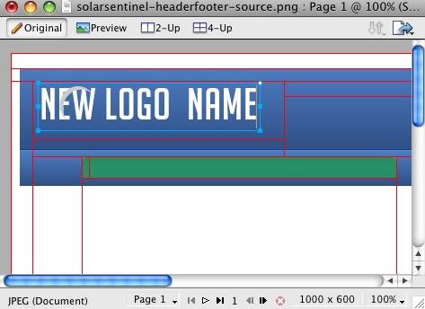
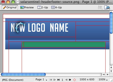
Logo

Step 2

Next, double click on the logo. This will activate the text tool so you can edit the element. Highlight the entire text box with your cursor and type your text instead (such as your company name.)

Logo

You will notice the crescent icon above the logo name, you can keep it but in this guide we shall remove it.
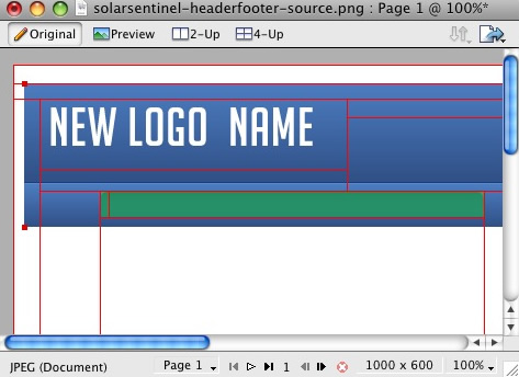
Logo

Logo

Step 3

Next, reactivate the Web Layers slice. As you did in the initial step, select the eye icon to make it visible and subsequently making the slices visible on the canvas. Select the logo slice, either on the canvas itself or in the Web Layers folder. If you find the slice is too small, hover your cursor over the blue points around the slice and drag it to a new size.
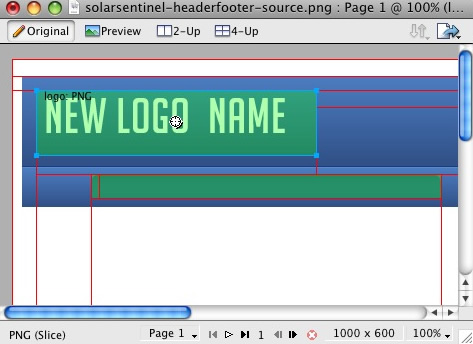
Logo

Step 4

To export your logo, right click on the green slice that is situated above your new logo. A popup menu should appear with numerous options. The value we want to deal with is «Export Selected Slice…». As the name suggests, this option will export/save this slice only out of the entire source window.
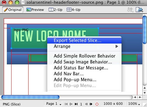
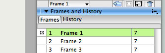
Logo

Step 5

If you are new to Fireworks, you may be wondering why it appears that there is only one style variation in the source. This is not the case as we take advantage of the Frame features of Fireworks. You need to simply switch frames to see all the other style variation sources.

There are a few ways to change frames and we will show 2 methods that you can use.

In the right column where you find the Layers toolbar including the Web Layers area, you should see another tab/toolbar named Frames. Just left click on the title Frames to enter the frames area. Then you can click on either of the frames which are named to show which style variant is on that particular frame.

Logo

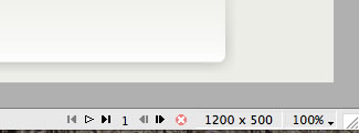
The second method is the most easiest and simplistic. At the bottom of the Fireworks canvas is a row of buttons, arrows just as previous and next. Select the arrows to switch between frames.

Logo

[span class=attention]By default, the source should set the export file format to PNG32. If this is not the case, you will need to change your Fireworks export settings. Firstly, expand the Optimise & Align taskbar in the upper right of Fireworks. From the available dropdowns, select PNG32.[/span]

Step 6

Once you have successfully edited then exported your new logo, you will need to upload it to your server. This process is best done via a FTP client such as Filezilla

  1. Open your FTP client on your local computer.
  2. Login to your web server where SolarSentinel is installed.
  3. Navigate to the /templates/rt_solarsentinel_j15/images/header/*style* directory.
  4. Upload logo.png (and any other logo related images) to this directory (You may need to browse on the local panel in the FTP client to find where you have exported your logo).
  5. Clear your browser cache before viewing such as using the keyboard commands on Windows, Ctrl+F5.

[span class=attention]
Ensure that you are uploading the correct logo to avoid confusion if it does not change. Also take into account hosting permissions. Sometimes, hosts which are not designed for Joomla may have permissions not suited for the setup, thus, the upload will not be complete. In this case, contact your hosting provider.
[/span]

Publicado en: Sin categoría

Configuration

17/04/2009 por admin

A guide to the many configurable options that can be configured in the template manager.


Preset Style

The template is bundled with 10 pre-made style variants that can be easily and quickly chosen from the template configuration. There is also an option for Custom which you will choose if you do not wish to use the preset styles.

[span class=attention]NOTE: The various options will not work unless you click Custom in the Preset Styles section.[/span]

Colour Chooser Options

If you selected Custom in the Preset Styles option, you will now have a choice of several options to customise your sites colour scheme. Therefore, you can either manually type your desired colour into the input field or select the colour from the popup.

The names of the various selections denote the area that they apply to.

[span class=alert]Click the Custom Styles button in the toolbar to output your custom style configuration into the Custom Config output box, underneath all the params. You will use these values in the styles.php file to customise your own defaults.[/span]

Display Frontpage Component

This setting allows you to select whether the frontpage area (where content items are placed) is active or not. This is useful if you wish to have an entirely modular frontpage and no article-based content.

IE6 Warning

Warn your visitors using Internet Explorer 6 to upgrade to a more secure version with this toggle. This option activates a javascript based dropdown in IE6 at the top of the template where a description of why IE6 is a redundant browser is visible. The warning will only appear once as it is stored via a cookie.

Font Family

You can choose which font you would like to use for your entire website, these are all web standard fonts.

Font Spans

Set to Enable or Disable Font Spans. Font Spans refer to the multi-coloured effect on titles, such as module headers.

Input Style

Set to Enable or Disable Input Styles. This is the javascript enabled custom styling for radio icons and similar inputs such as in the Poll. You can see these icons in the params above.

Template Width

This template configuration option allows you to easily change the width of the template itself, simply change the number to another pixel value.

Left Inset Width

This template configuration option allows you to easily change the width of the left inset position, simply change the number to another pixel value.

Right Inset Width

This template configuration option allows you to easily change the width of the right inset position, simply change the number to another pixel value.

Splitmenu Location

One of the template’s menu options is splitmenu which displays the first level items in the horizontal menu bar and the 2nd in a side column module. This option allows you to choose between the left column or the right column.

Default Font

This option allows you to choose what the font size will be, you have 3 options to choose from, these are small, default and large.

Show Date

Choose whether the date, in the upper left of the template appears.

Client Side Date

Select whether the date is server based or based on the time and date of your visitors computer.

Show Main Logo

Choose whether the logo area has the template logo image, or is the logo module position. If this option is set to no and there are no modules assigned to the logo area, it will collapse completely.

Show Logo Slogan Text

Choose whether the slogan, to the right of logo appears.

Slogan Text

Enter the text you wish to appear for the slogan.

Show Copyright

Choose whether the copyright area has the RocketTheme logo image, or is the footer module position. If this option is set to no and there are no modules assigned to the footer area, it will collapse completely.

Show Text Size Controls

This setting allows you to disable the text size controls in the upper right of the template.

Show Top Button

This setting allows you to disable the top button in the lower right of the template.

Mootools / Javascript Compatibility

Enable or disable js compatibility mode for better compatibility with non mootools based js libraries. Warning, setting to «true» will cause several js template features to not work properly.

Menu Type

SolarSentinel is bundled with 4 menu options, 3 of which are integrated menu approaches. These are splitmenu, moomenu, suckerfish and module. Splitmenu displays the 1st level menu items in the horizontal bar and the 2nd in the side column; moomenu and suckerfish display the menu items in dropdown lists with moomenu having a javascript powered approach; and the module options turns the menu bar into the toolbar module position so you can insert modules into the area (this will disable the menu however). You can also select none so the entire horizontal menu does not appear.

Drop Down Rows per Column

The maximum number of menu item rows per column. Applicable only to MooMenu and Suckerfish, as well as second+ menu levels.

Drop Down Columns

The number of columns for a dropdown. Applicable only to MooMenu and Suckerfish, as well as second+ menu levels.

Multi-Column Level

The menu level that is affected by the multiple column dropdown affect. Set to 0 to affect all dropdown levels or set a number greater than 0 to specify a particular level with the multiple column function. Applicable only to MooMenu and Suckerfish.

Menu Name

The following parameter controls which Joomla menu is loaded for the horizontal navigation bar, by default this is mainmenu but you can change it to whatever menu such as othermenu.

Publicado en: Sin categoría

Menu Options

17/04/2009 por admin

[span class=alert]Note: RokNavMenu is an essential module for the template. It is required for the modules to work so ensure that you install it into Joomla.[/span]

SolarSentinel features an array of elegant, professional and exclusive menu systems. Here you can read an overview of
the available menu configuration options.

[span class=attention]
Video Tutorial Currently Available!

Launch the Joomla Menu Setup Video Tutorial now![/span]

Selecting your Menu Style

SolarSentinel allows you to choose from 4 menu modes:

[list class=bullet-1][li]RokMooMenu – The advanced menu system based on the ever popular Suckerfish menu style, featuring mootools powered transitions and effects.[/li]
[li]Suckerfish – The versatile dropdown menu is an option in combination with RokMooMenu to minimize library conflicts and improve site performance.[/li]
[li]SplitMenu – The venerable SplitMenu is a solid choice for navigation. It works by rendering the top-level menu options horizontally, and the submenu/child items are rendered in a module on the side.[/li]
[li]No Menu Bar – Setting the menu type to «none» will remove the horizontal menu as well as the menu bar graphics making the header flush with the main content giving you more control over the appearance of your site.[/li][/list]

You can designate which menu type you want to use on your site with a single control in the template configuration.

DropColumn Menu

A brand new menu function, the Multiple Drop Column ability. This applies only to MooMenu and Suckerfish and allows for multiple drop down columns instead of the typical single variant. The advanced options with this feature, allow you to choose the number of columns, specify individual menu levels which exhibit the behaviour and restrict the number of columns per row. A truly versatile new feature as showcased on this demo.

The Powerful & Popular RokMooMenu

This menu has been developed from scratch using the latest and greatest MooTools JavaScript framework. The RokMooMenu is a highly advanced and fully customisable menu system. Some of the great features include:-

[list class=bullet-1][li]Hover support for IE6 using the sfHover javascript class just like in Suckerfish.[/li]
[li]Fully degradable to standard SuckerFish menu if javascript is not supported.[/li]
[li]Configurable mouse-out delay to allow for accidental mousing out of the menu.[/li]
[li]Completely customizable animation effects using MooTools transitions. Can be configured in X and/or Y directions.[/li]
[li]Support for fade-in transparency[/li]
[li]Experimental support for IE6 z-index bug using the iFrame hack.[/li][/list]

An example configuration as used in the demo:


[span class=attention]For more details with diagrams, visit the Mootools documentation site[/span]

Creating the dropdown menu items

To have specific menu items appear as sub items, you must assign them to the specific navigation item in which they will originate from. The following tutorial will show you how simple it is to create your ideal menu system.

Step 1 – Navigation

Once you have logged into the Joomla! Administration Area, you must navigate to the Menu area. Hover over the Menu item in the taskbar to show the dropdown menu. For this example, we are going into the mainmenu but the technique is exactly the same for all menus in the Administrative area.

Step 2 – The Menu Manager

You will then be transported to the Menu Manager for mainmenu. At this point, you can do two things. The first is to edit an existing menu item, which we will be doing in this tutorial or create a New menu item to be subordinate to an existing item. Click on the item you want to be part of the dropdown menu.

Step 3 – Assigning a Parent Item

You can now assign the content item to the mainmenu item in which you want to be in the dropdown menu. Identify the «Parent Item» section of the manager. You will select the item in which you wish to be the parent and the source of the dropdown menu. In this example, we have selected «Home».

Publicado en: Sin categoría

Installation

17/04/2009 por admin

The following is a guide that covers how to set up your new template on your Joomla site. Here you can find an overview of the files included in the SolarSentinel release and instructions on installing and activating the template in your Joomla install.

[span class=attention]
Video Tutorial Currently Available!
Launch the Joomla Template Installation Video Tutorial now!
[/span]

Downloading the necessary files

The first step is to download all the necessary files needed for installation, setup and configuration. Below is a summary of each of the available packages for the SolarSentinel release.

[list class=bullet-1][li]SolarSentinel Template (rt_solarsentinel_j15.tgz) This file is the template package you will use to install your template into Joomla.[/li]

[li]SolarSentinel Custom Extensions (solarsentinel-extensions-j15.zip) This package contains each of the individual custom extensions included in the SolarSentinel template release.[/li]

[li]SolarSentinel Source PNG(s) (solarsentinel-sources.zip) This zip contains the source PNG(s) for making modifications and customisations to the images in the template (and if applicable, the font used for the logo). You will need an image editing software (preferably Adobe/Macromedia Fireworks) to utilise the Source PNG files. [/li]

[li]SolarSentinel RocketLauncher (Joomla_RT_SolarSentinel_j15.zip) This is the RocketLauncher pack for SolarSentinel which is a complete and separate Joomla install which has the template pre-installed and configured. Similarly, the demo content is injected and the extensions are also pre-installed.[/li][/list]

Step 1 – Using the Joomla installer

Navigate to the Joomla administrator (http://yoursite.com/administrator) for your site. Along the top menu bar, go to Extensions → Install/Uninstall. Next, select the browser button and locate the rt_solarsentinel_j15.tgz package on your computer that you downloaded. Then, click Upload File & Install. After installation, an introduction page will appear with the template’s name, description and thumbnail, select Continue when this page appears. You should now see rt_solarsentinel_j15 in the list of installed templates.

Step 2 – Making SolarSentinel Default

In the Joomla Administrator, navigate to Extensions → Template Manager. You will be directed to a page which lists all the installed templates. Locate rt_solarsentinel_j15 in the list. Select the radio button / circular icon to the left of the name. Then select the Default in button menu in the top right area of the Administrator. The SolarSentinel template will now be the default template on your Joomla site.

Publicado en: Sin categoría

Tutorials

17/04/2009 por admin

[tutorial url=»index.php?option=com_content&view=article&id=59&Itemid=70″ img=»images/tutorials/icon1.png» title=»Installation» label=»Read More…»]An overview of template files and instructions for installing and activating the template.[/tutorial]

[tutorial url=»index.php?option=com_content&view=article&id=60&Itemid=71″ img=»images/tutorials/icon2.png» title=»Extensions» label=»Read More…»]Learn all about the included custom modules and how to configure them for your site.[/tutorial]

[tutorial url=»index.php?option=com_content&view=article&id=61&Itemid=72″ img=»images/tutorials/icon3.png» title=»Menu Options» label=»Read More…»]An overview of the menu options including the top menu icon configuration.[/tutorial]

[tutorial url=»index.php?option=com_content&view=article&id=62&Itemid=73″ img=»images/tutorials/icon4.png» title=»Configuration» label=»Read More…»]A guide to the many configurable options that can be selected within the template manager.[/tutorial]

[tutorial url=»index.php?option=com_content&view=article&id=64&Itemid=74″ img=»images/tutorials/icon5.png» title=»Using Typography» label=»Read More…»]A guide to using the included the typography styles for your site.[/tutorial]

[tutorial url=»index.php?option=com_content&view=article&id=65&Itemid=75″ img=»images/tutorials/icon6.png» title=»Demo Content» label=»Read More…»]A look at some of the modules and techniques used in the demo content on the frontpage of this demo.[/tutorial]

[tutorial url=»index.php?option=com_content&view=article&id=63&Itemid=76″ img=»images/tutorials/icon7.png» title=»Logo Editing» label=»Read More…»]An overview for customizing your logo and replacing the logo text with your organization or company name and logo.[/tutorial]

[tutorial url=»index.php?option=com_content&view=article&id=66&Itemid=77″ img=»images/tutorials/icon8.png» title=»IE6 PNG fix» label=»Read More…»]An overview of how to utilise and understand the Internet Explorer 6 PNG fix.[/tutorial]

[contentheading]More SolarSentinel Template Tutorials[/contentheading]

Continue learning how to configure and customize the SolarSentinel template with the following guides and tutorials available in the RocketTheme members forum board.

  • Change side column width
  • Adding a header position
  • Change template text
  • Logo Changes
  • Disable the Template Scripts
  • Removing/Editing Logo/Footer Links

Publicado en: Sin categoría

HTML Typography

17/04/2009 por admin

This tutorial page features all the typography available with the template, showcasing them in HTML form. If you wish to use the RokCandy format, which is WYSIWYG friendly, please go to the RokCandy Typography page.

This page shows all of the typography styles and settings in action. If you would like to read more detailed information on inserting the included typography into your content, check out the Typography Tutorial.

This is a ComponentHeading

Praesent rutrum sapien ac felis. Phasellus elementum dolor quis turpis. Vestibulum nec mi vitae pede tincidunt nonummy. Vestibulum facilisis mollis neque. Sed orci. Cum sociis natoque penatibus et magnis dis parturient montes, nascetur ridiculus mus. Sed euismod magna a nibh.

This is a Contentheading

Proin ac nunc eu nunc condimentum accumsan. Phasellus odio justo, euismod vitae, egestas a, porttitor in, urna. Maecenas vitae mauris. Donec vestibulum, nunc eu varius pharetra, massa est sagittis odio, sit amet eleifend elit dolor id tortor.

This is an H1 Header

Lorem ipsum dolor sit amet, consectetuer adipiscing elit. Proin sit amet odio quis sapien molestie ultrices. Vivamus quis lectus. Praesent eu mi. Curabitur pharetra leo sed nisl. Nunc vel nisi. Aliquam nulla. Etiam at est. Pellentesque arcu diam, tempus nec, sodales eu, ullamcorper quis, risus.

This is an H2 Header

Proin ac nunc eu nunc condimentum accumsan. Phasellus odio justo, euismod vitae, egestas a, porttitor in, urna. Maecenas vitae mauris. Donec vestibulum, nunc eu varius pharetra, massa est sagittis odio, sit amet eleifend elit dolor id tortor.

This is an H3 Header

Mauris euismod. In ac massa vitae quam tincidunt dapibus. Ut at tortor nec mi mattis blandit. Maecenas venenatis lorem at nulla. Phasellus a libero. Sed odio odio, eleifend dignissim, feugiat vel, tempor nec, ligula. Suspendisse lacinia convallis nulla. Vestibulum posuere, lacus aliquet pulvinar faucibus, tortor urna luctus diam, vitae ultrices ante magna non tellus.

This is an H4 Header

Mauris euismod. In ac massa vitae quam tincidunt dapibus. Ut at tortor nec mi mattis blandit. Maecenas venenatis lorem at nulla. Phasellus a libero. Sed odio odio, eleifend dignissim, feugiat vel, tempor nec, ligula. Suspendisse lacinia convallis nulla. Vestibulum posuere, lacus aliquet pulvinar faucibus, tortor urna luctus diam, vitae ultrices ante magna non tellus.

This is an H5 Header

Mauris euismod. In ac massa vitae quam tincidunt dapibus. Ut at tortor nec mi mattis blandit. Maecenas venenatis lorem at nulla. Phasellus a libero. Sed odio odio, eleifend dignissim, feugiat vel, tempor nec, ligula. Suspendisse lacinia convallis nulla. Vestibulum posuere, lacus aliquet pulvinar faucibus, tortor urna luctus diam, vitae ultrices ante magna non tellus.

Notice Styles are shown below

This is a sample of the ‘attention’ style. Use this style to denote very important information to your users. To use this use the folllowing html: <span class=»attention»>….</span>

This is a sample of the ‘notice’ style. Use this style to denote very important information to your users. To use this use the folllowing html: <span class=»notice»>….</span>

This is a sample of the ‘alert’ style. Use this style to denote very important information to your users. To use this use the folllowing html: <span class=»alert»>….</span>

This is a sample of the ‘download’ style. Use this style to denote very important information to your users. To use this use the folllowing html: <span class=»download»>….</span>

This is a sample of the ‘approved’ style. Use this style to denote very important information to your users. To use this use the folllowing html: <span class=»approved»>….</span>

This is a sample of the ‘media’ style. Use this style to denote very important information to your users. To use this use the folllowing html: <span class=»media»>….</span>

This is a sample of the ‘note’ style. Use this style to denote very important information to your users. To use this use the folllowing html: <span class=»note»>….</span>

This is a sample of the ‘cart’ style. Use this style to denote very important information to your users. To use this use the folllowing html: <span class=»cart»>….</span>

This is a sample of the ‘camera’ style. Use this style to denote very important information to your users. To use this use the folllowing html: <span class=»camera»>….</span>

This is a sample of the ‘doc’ style. Use this style to denote very important information to your users. To use this use the folllowing html: <span class=»doc»>….</span>

This is a sample <pre>...</pre> tag:

div.modulebox-black div.bx1 {
  background: url(../images/black/box_bl.png) 0 100% no-repeat; 
}

div.modulebox-black div.bx2 {
  background: url(../images/black/box_tr.png) 100% 0 no-repeat;
}

div.modulebox-black div.bx3 {
  background: url(../images/black/box_tl.png) 0 0 no-repeat;
  padding: 0;
  margin: 0;
}

Blockquote Styles

This is a blockquote, you will want to use the following formatting: <blockquote>….</blockquote>Praesent rutrum sapien ac felis. Phasellus elementum dolor quis turpis. Vestibulum nec mi vitae pede tincidunt nonummy. Vestibulum facilisis mollis neque. Sed orci. Cum sociis natoque penatibus et magnis dis parturient montes, nascetur ridiculus mus. Sed euismod magna a nibh.

This is a blockquote, you will want to use the following formatting: <blockquote class="blue">…</blockquote> Praesent rutrum sapien ac felis. Phasellus elementum dolor quis turpis. Vestibulum nec mi vitae pede tincidunt nonummy. Vestibulum facilisis mollis neque. Sed orci. Cum sociis natoque penatibus et magnis dis parturient montes, nascetur ridiculus mus. Sed euismod magna a nibh.

This is a blockquote, you will want to use the following formatting: <blockquote class="red">…</blockquote>Praesent rutrum sapien ac felis. Phasellus elementum dolor quis turpis. Vestibulum nec mi vitae pede tincidunt nonummy. Vestibulum facilisis mollis neque. Sed orci. Cum sociis natoque penatibus et magnis dis parturient montes, nascetur ridiculus mus. Sed euismod magna a nibh.

This is a blockquote, you will want to use the following formatting: <blockquote class="green">…</blockquote>Praesent rutrum sapien ac felis. Phasellus elementum dolor quis turpis. Vestibulum nec mi vitae pede tincidunt nonummy. Vestibulum facilisis mollis neque. Sed orci. Cum sociis natoque penatibus et magnis dis parturient montes, nascetur ridiculus mus. Sed euismod magna a nibh.

This is a blockquote, you will want to use the following formatting: <blockquote class="purple">…</blockquote>Praesent rutrum sapien ac felis. Phasellus elementum dolor quis turpis. Vestibulum nec mi vitae pede tincidunt nonummy. Vestibulum facilisis mollis neque. Sed orci. Cum sociis natoque penatibus et magnis dis parturient montes, nascetur ridiculus mus. Sed euismod magna a nibh.

This is a blockquote, you will want to use the following formatting: <blockquote class="orange">…</blockquote>Praesent rutrum sapien ac felis. Phasellus elementum dolor quis turpis. Vestibulum nec mi vitae pede tincidunt nonummy. Vestibulum facilisis mollis neque. Sed orci. Cum sociis natoque penatibus et magnis dis parturient montes, nascetur ridiculus mus. Sed euismod magna a nibh.

This is a blockquote, you will want to use the following formatting: <blockquote class="brown">…</blockquote>Praesent rutrum sapien ac felis. Phasellus elementum dolor quis turpis. Vestibulum nec mi vitae pede tincidunt nonummy. Vestibulum facilisis mollis neque. Sed orci. Cum sociis natoque penatibus et magnis dis parturient montes, nascetur ridiculus mus. Sed euismod magna a nibh.

This is a blockquote, you will want to use the following formatting: <blockquote class="grey">…</blockquote>Praesent rutrum sapien ac felis. Phasellus elementum dolor quis turpis. Vestibulum nec mi vitae pede tincidunt nonummy. Vestibulum facilisis mollis neque. Sed orci. Cum sociis natoque penatibus et magnis dis parturient montes, nascetur ridiculus mus. Sed euismod magna a nibh.

List Styles – Bullets

Below is a list with bullets. To use this style create a list in the following format: <ul class=»class name«><li>….</li><li>….</li>…</ul>

  • To use this style create a list in the following format: <ul class=»bullet-1«><li>….</li><li>….</li>…</ul>.
  • To use this style create a list in the following format: <ul class=»bullet-2«><li>….</li><li>….</li>…</ul>.
  • To use this style create a list in the following format: <ul class=»bullet-3«><li>….</li><li>….</li>…</ul>.
  • To use this style create a list in the following format: <ul class=»bullet-4«><li>….</li><li>….</li>…</ul>.
  • To use this style create a list in the following format: <ul class=»bullet-5«><li>….</li><li>….</li>…</ul>.
  • To use this style create a list in the following format: <ul class=»bullet-6«><li>….</li><li>….</li>…</ul>.
  • To use this style create a list in the following format: <ul class=»bullet-7«><li>….</li><li>….</li>…</ul>.
  • To use this style create a list in the following format: <ul class=»bullet-8«><li>….</li><li>….</li>…</ul>.

List Styles – Special Icons

Below is a list with special icons. To use this style create a list in the following format: <ul class=»class name«><li>….</li><li>….</li>…</ul>

  • To use this style create a list in the following format: <ul class=»special-1«><li>….</li><li>….</li>…</ul>.
  • To use this style create a list in the following format: <ul class=» special-2«><li>….</li><li>….</li>…</ul>.
  • To use this style create a list in the following format: <ul class=» special-3«><li>….</li><li>….</li>…</ul>.
  • To use this style create a list in the following format: <ul class=» special-4«><li>….</li><li>….</li>…</ul>.
  • To use this style create a list in the following format: <ul class=» special-5«><li>….</li><li>….</li>…</ul>.
  • To use this style create a list in the following format: <ul class=» special-6«><li>….</li><li>….</li>…</ul>.
  • To use this style create a list in the following format: <ul class=» special-7«><li>….</li><li>….</li>…</ul>.
  • To use this style create a list in the following format: <ul class=» special-8«><li>….</li><li>….</li>…</ul>.
  • To use this style create a list in the following format: <ul class=» special-9«><li>….</li><li>….</li>…</ul>.
  • To use this style create a list in the following format: <ul class=» special-10«><li>….</li><li>….</li>…</ul>.
  • To use this style create a list in the following format: <ul class=» special-11«><li>….</li><li>….</li>…</ul>.
  • To use this style create a list in the following format: <ul class=» special-12«><li>….</li><li>….</li>…</ul>.
  • To use this style create a list in the following format: <ul class=» special-13«><li>….</li><li>….</li>…</ul>.
  • To use this style create a list in the following format: <ul class=» special-14«><li>….</li><li>….</li>…</ul>.

Span Styles – Number

Below is a list with number. To use this style create a list in the following format: <span class="number-[color2]">1[any number]</span>

1To use this style create a list in the following format: <p><span class="number">1</span>.…some content….</p>

2To use this style create a list in the following format: <p><span class="number">2</span>.…some content….</p>

3To use this style create a list in the following format: <p><span class="number">3</span>.…some content….</p>

1To use this style create a list in the following format: <p><span class="number-red">1</span>.…some content….</p>

2To use this style create a list in the following format: <p><span class="number-blue">2</span>.…some content….</p>

3To use this style create a list in the following format: <p><span class="number-green">3</span>.…some content….</p>

1To use this style create a list in the following format: <p><span class="number-purple">1</span>.…some content….</p>

2To use this style create a list in the following format: <p><span class="number-orange">2</span>.…some content….</p>

3To use this style create a list in the following format: <p><span class="number-brown">3</span>.…some content….</p>

4To use this style create a list in the following format: <p><span class="number-grey">3</span>.…some content….</p>

Highlight Styles

This is a span that allows you to highlight words or phrases. Use the following format: <span class="highlight">…</span>

This is a span that allows you to highlight words or phrases. Use the following format: <span class="highlight-red">…</span>

This is a span that allows you to highlight words or phrases. Use the following format: <span class="highlight-blue">…</span>

This is a span that allows you to highlight words or phrases. Use the following format: <span class="highlight-green">…</span>

This is a span that allows you to highlight words or phrases. Use the following format: <span class="highlight-orange">…</span>

This is a span that allows you to highlight words or phrases. Use the following format: <span class="highlight-brown">…</span>

This is a span that allows you to highlight words or phrases. Use the following format: <span class="highlight-purple">…</span>

This is a span that allows you to highlight words or phrases. Use the following format: <span class="highlight-grey">…</span>

This is a span that allows you to highlight words or phrases. Use the following format: <span class="highlight-bold">…</span>

Inset Styles

Praesent rutrum sapien ac felis. Phasellus elementum dolor quis turpis. Vestibulum nec mi vitae pede tincidunt nonummy. Vestibulum facilisis mollis neque. Sed orci. Cum sociis natoque penatibus et magnis dis parturient montes, nascetur ridiculus mus.You will need to use the following formatting: <span class="inset-right">…some content…</span>Vestibulum facilisis mollis neque. Sed orci. Cum sociis natoque penatibus et magnis dis parturient montes, nascetur ridiculus mus. Sed euismod magna a nibh.

Sed euismod magna a nibh. Praesent rutrum sapien ac felis. Phasellus elementum dolor quis turpis. Vestibulum nec mi vitae pede tincidunt nonummy. Praesent rutrum sapien ac felis. Phasellus elementum dolor quis turpis. Vestibulum nec mi vitae pede tincidunt nonummy. Vestibulum facilisis mollis neque. Sed orci. Cum sociis natoque penatibus et magnis dis parturient montes, nascetur ridiculus mus.Praesent rutrum sapien ac felis. Phasellus elementum dolor quis turpis. Vestibulum nec mi vitae pede tincidunt nonummy. Vestibulum facilisis mollis neque. Sed orci. Cum sociis natoque penatibus et magnis dis parturient montes, nascetur ridiculus mus.

Praesent rutrum sapien ac felis. Phasellus elementum dolor quis turpis. Vestibulum nec mi vitae pede tincidunt nonummy. Vestibulum facilisis mollis neque. Sed orci. Cum sociis natoque penatibus et magnis dis parturient montes, nascetur ridiculus mus.You will need to use the following formatting: <span class="inset-left">…some content…</span>Vestibulum facilisis mollis neque. Sed orci. Cum sociis natoque penatibus et magnis dis parturient montes, nascetur ridiculus mus. Sed euismod magna a nibh.

Sed euismod magna a nibh. Praesent rutrum sapien ac felis. Phasellus elementum dolor quis turpis. Vestibulum nec mi vitae pede tincidunt nonummy. Praesent rutrum sapien ac felis. Phasellus elementum dolor quis turpis. Vestibulum nec mi vitae pede tincidunt nonummy. Vestibulum facilisis mollis neque. Sed orci. Cum sociis natoque penatibus et magnis dis parturient montes, nascetur ridiculus mus.Praesent rutrum sapien ac felis. Phasellus elementum dolor quis turpis. Vestibulum nec mi vitae pede tincidunt nonummy. Vestibulum facilisis mollis neque. Sed orci. Cum sociis natoque penatibus et magnis dis parturient montes, nascetur ridiculus mus.

DropCap Styles

PPraesent rutrum sapien ac felis. Phasellus elementum dolor quis turpis. Vestibulum nec mi vitae pede tincidunt nonummy. Vestibulum facilisis mollis neque. Sed orci. Cum sociis natoque penatibus et magnis dis parturient montes, nascetur ridiculus mus. Sed euismod magna a nibh. Praesent rutrum sapien ac felis. Phasellus elementum dolor quis turpis. Vestibulum nec mi vitae pede tincidunt nonummy. Vestibulum facilisis mollis neque. Sed orci. Cum sociis natoque penatibus et magnis dis parturient montes, nascetur ridiculus mus. Sed euismod magna a nibh.

You will need to use the following formatting: <p><span class="dropcap">P</span></p>

PPraesent rutrum sapien ac felis. Phasellus elementum dolor quis turpis. Vestibulum nec mi vitae pede tincidunt nonummy. Vestibulum facilisis mollis neque. Sed orci. Cum sociis natoque penatibus et magnis dis parturient montes, nascetur ridiculus mus. Sed euismod magna a nibh. Praesent rutrum sapien ac felis. Phasellus elementum dolor quis turpis. Vestibulum nec mi vitae pede tincidunt nonummy. Vestibulum facilisis mollis neque. Sed orci. Cum sociis natoque penatibus et magnis dis parturient montes, nascetur ridiculus mus. Sed euismod magna a nibh.

You will need to use the following formatting: <p><span class="dropcap-red">P</span></p>

PPraesent rutrum sapien ac felis. Phasellus elementum dolor quis turpis. Vestibulum nec mi vitae pede tincidunt nonummy. Vestibulum facilisis mollis neque. Sed orci. Cum sociis natoque penatibus et magnis dis parturient montes, nascetur ridiculus mus. Sed euismod magna a nibh. Praesent rutrum sapien ac felis. Phasellus elementum dolor quis turpis. Vestibulum nec mi vitae pede tincidunt nonummy. Vestibulum facilisis mollis neque. Sed orci. Cum sociis natoque penatibus et magnis dis parturient montes, nascetur ridiculus mus. Sed euismod magna a nibh.

You will need to use the following formatting: <p><span class="dropcap-blue">P</span></p>

PPraesent rutrum sapien ac felis. Phasellus elementum dolor quis turpis. Vestibulum nec mi vitae pede tincidunt nonummy. Vestibulum facilisis mollis neque. Sed orci. Cum sociis natoque penatibus et magnis dis parturient montes, nascetur ridiculus mus. Sed euismod magna a nibh. Praesent rutrum sapien ac felis. Phasellus elementum dolor quis turpis. Vestibulum nec mi vitae pede tincidunt nonummy. Vestibulum facilisis mollis neque. Sed orci. Cum sociis natoque penatibus et magnis dis parturient montes, nascetur ridiculus mus. Sed euismod magna a nibh.

You will need to use the following formatting: <p><span class="dropcap-green">P</span></p>

PPraesent rutrum sapien ac felis. Phasellus elementum dolor quis turpis. Vestibulum nec mi vitae pede tincidunt nonummy. Vestibulum facilisis mollis neque. Sed orci. Cum sociis natoque penatibus et magnis dis parturient montes, nascetur ridiculus mus. Sed euismod magna a nibh. Praesent rutrum sapien ac felis. Phasellus elementum dolor quis turpis. Vestibulum nec mi vitae pede tincidunt nonummy. Vestibulum facilisis mollis neque. Sed orci. Cum sociis natoque penatibus et magnis dis parturient montes, nascetur ridiculus mus. Sed euismod magna a nibh.

You will need to use the following formatting: <p><span class="dropcap-purple">P</span></p>

PPraesent rutrum sapien ac felis. Phasellus elementum dolor quis turpis. Vestibulum nec mi vitae pede tincidunt nonummy. Vestibulum facilisis mollis neque. Sed orci. Cum sociis natoque penatibus et magnis dis parturient montes, nascetur ridiculus mus. Sed euismod magna a nibh. Praesent rutrum sapien ac felis. Phasellus elementum dolor quis turpis. Vestibulum nec mi vitae pede tincidunt nonummy. Vestibulum facilisis mollis neque. Sed orci. Cum sociis natoque penatibus et magnis dis parturient montes, nascetur ridiculus mus. Sed euismod magna a nibh.

You will need to use the following formatting: <p><span class="dropcap-orange">P</span></p>

PPraesent rutrum sapien ac felis. Phasellus elementum dolor quis turpis. Vestibulum nec mi vitae pede tincidunt nonummy. Vestibulum facilisis mollis neque. Sed orci. Cum sociis natoque penatibus et magnis dis parturient montes, nascetur ridiculus mus. Sed euismod magna a nibh. Praesent rutrum sapien ac felis. Phasellus elementum dolor quis turpis. Vestibulum nec mi vitae pede tincidunt nonummy. Vestibulum facilisis mollis neque. Sed orci. Cum sociis natoque penatibus et magnis dis parturient montes, nascetur ridiculus mus. Sed euismod magna a nibh.

You will need to use the following formatting: <p><span class="dropcap-brown">P</span></p>

PPraesent rutrum sapien ac felis. Phasellus elementum dolor quis turpis. Vestibulum nec mi vitae pede tincidunt nonummy. Vestibulum facilisis mollis neque. Sed orci. Cum sociis natoque penatibus et magnis dis parturient montes, nascetur ridiculus mus. Sed euismod magna a nibh. Praesent rutrum sapien ac felis. Phasellus elementum dolor quis turpis. Vestibulum nec mi vitae pede tincidunt nonummy. Vestibulum facilisis mollis neque. Sed orci. Cum sociis natoque penatibus et magnis dis parturient montes, nascetur ridiculus mus. Sed euismod magna a nibh.

You will need to use the following formatting: <p><span class="dropcap-grey">P</span></p>

Important Emphasis Styles

Sample Title
This is a span that lets you place all of the content into a nice well formed section. You will need to use the following formatting: <div class="important"><span class="important-title">Sample Title</span>…some content…</div>

Sample TitleThis is a span that lets you place all of the content into a nice well formed section. You will need to use the following formatting: <div class="important-blue"><span class="important-title-blue">Sample Title</span>…some content…</div>

Sample TitleThis is a span that lets you place all of the content into a nice well formed section. You will need to use the following formatting: <div class="important-red"><span class="important-title-red">Sample Title</span>…some content…</div>

Sample TitleThis is a span that lets you place all of the content into a nice well formed section. You will need to use the following formatting: <div class="important-green"><span class="important-title-green">Sample Title</span>…some content…</div>

Sample TitleThis is a span that lets you place all of the content into a nice well formed section. You will need to use the following formatting: <div class="important-purple"><span class="important-title-purple">Sample Title</span>…some content…</div>

Sample TitleThis is a span that lets you place all of the content into a nice well formed section. You will need to use the following formatting: <div class="important-brown"><span class="important-title-brown">Sample Title</span>…some content…</div>

Sample TitleThis is a span that lets you place all of the content into a nice well formed section. You will need to use the following formatting: <div class="important-orange"><span class="important-title-orange">Sample Title</span>…some content…</div>

Sample TitleThis is a span that lets you place all of the content into a nice well formed section. You will need to use the following formatting: <div class="important-grey"><span class="important-title-grey">Sample Title</span>…some content…</div>

Publicado en: Sin categoría

RokCandy Typography

17/04/2009 por admin

[span class=alert]The RokCandy component is required for the syntax below to work.[/span]

The below examples are using the syntax that functions when you use the new RocketTheme component, RokCandy. RokCandy processes your content and changes the pre-defined syntax such as [important] to the correct, and pre-formatted HTML that had to be entered in manually before RokCandy. The component is compatible with WYSIWYG editors so you do not need to worry if you or your client, have little knowledge of HTML.

If you wish to view the typography page, showing how to setup the various typography elements with HTML, then please go to the HTML Typography page.

[componentheading]This is a ComponentHeading[/componentheading]

Praesent rutrum sapien ac felis. Phasellus elementum dolor quis turpis. Vestibulum nec mi vitae pede tincidunt nonummy. Vestibulum facilisis mollis neque. Sed orci. Cum sociis natoque penatibus et magnis dis parturient montes, nascetur ridiculus mus. Sed euismod magna a nibh.

[contentheading]This is a ContentHeading[/contentheading]

Proin ac nunc eu nunc condimentum accumsan. Phasellus odio justo, euismod vitae, egestas a, porttitor in, urna. Maecenas vitae mauris. Donec vestibulum, nunc eu varius pharetra, massa est sagittis odio, sit amet eleifend elit dolor id tortor.

[h1]This is an H1 Header[/h1]

Lorem ipsum dolor sit amet, consectetuer adipiscing elit. Proin sit amet odio quis sapien molestie ultrices. Vivamus quis lectus. Praesent eu mi. Curabitur pharetra leo sed nisl. Nunc vel nisi. Aliquam nulla. Etiam at est. Pellentesque arcu diam, tempus nec, sodales eu, ullamcorper quis, risus.

[h2]This is an H2 Header[/h2]

Proin ac nunc eu nunc condimentum accumsan. Phasellus odio justo, euismod vitae, egestas a, porttitor in, urna. Maecenas vitae mauris. Donec vestibulum, nunc eu varius pharetra, massa est sagittis odio, sit amet eleifend elit dolor id tortor.

[h3]This is an H3 Header[/h3]

Mauris euismod. In ac massa vitae quam tincidunt dapibus. Ut at tortor nec mi mattis blandit. Maecenas venenatis lorem at nulla. Phasellus a libero. Sed odio odio, eleifend dignissim, feugiat vel, tempor nec, ligula. Suspendisse lacinia convallis nulla. Vestibulum posuere, lacus aliquet pulvinar faucibus, tortor urna luctus diam, vitae ultrices ante magna non tellus.

[h4]This is an H4 Header[/h4]

Mauris euismod. In ac massa vitae quam tincidunt dapibus. Ut at tortor nec mi mattis blandit. Maecenas venenatis lorem at nulla. Phasellus a libero. Sed odio odio, eleifend dignissim, feugiat vel, tempor nec, ligula. Suspendisse lacinia convallis nulla. Vestibulum posuere, lacus aliquet pulvinar faucibus, tortor urna luctus diam, vitae ultrices ante magna non tellus.

[h5]This is an H5 Header[/h5]

Mauris euismod. In ac massa vitae quam tincidunt dapibus. Ut at tortor nec mi mattis blandit. Maecenas venenatis lorem at nulla. Phasellus a libero. Sed odio odio, eleifend dignissim, feugiat vel, tempor nec, ligula. Suspendisse lacinia convallis nulla. Vestibulum posuere, lacus aliquet pulvinar faucibus, tortor urna luctus diam, vitae ultrices ante magna non tellus.

[h4]Notice Styles are shown below[/h4]

[span class=attention]This is a sample of the ‘attention’ style. Use this style to denote very important information to your users. To use this use the following html: [span class=attention] …some content…. [/span][/span]

[span class=notice]This is a sample of the ‘notice’ style. Use this style to denote very important information to your users. To use this use the following html: [span class=notice] …some content…. [/span][/span]

[span class=alert]This is a sample of the ‘alert’ style. Use this style to denote very important information to your users. To use this use the following html: [span class=alert] …some content…. [/span][/span]

[span class=download]This is a sample of the ‘download’ style. Use this style to denote very important information to your users. To use this use the following html: [span class=download] …some content…. [/span][/span]

[span class=approved]This is a sample of the ‘approved’ style. Use this style to denote very important information to your users. To use this use the following html: [span class=approved] …some content…. [/span][/span]

[span class=media]This is a sample of the ‘media’ style. Use this style to denote very important information to your users. To use this use the following html: [span class=media] …some content…. [/span][/span]

[span class=note]This is a sample of the ‘note’ style. Use this style to denote very important information to your users. To use this use the following html: [span class=note] …some content…. [/span][/span]

[span class=cart]This is a sample of the ‘cart’ style. Use this style to denote very important information to your users. To use this use the following html: [span class=card] …some content…. [/span][/span]

[span class=camera]This is a sample of the ‘camera’ style. Use this style to denote very important information to your users. To use this use the following html: [span class=camera] …some content…. [/span][/span]

[span class=doc]This is a sample of the ‘doc’ style. Use this style to denote very important information to your users. To use this use the following html: [span class=doc] …some content…. [/span][/span]

[pre]
This is a sample [pre] … [/pre] tag:

div.modulebox-black div.bx1 {
background: url(../images/black/box_bl.png) 0 100% no-repeat;
}

div.modulebox-black div.bx2 {
background: url(../images/black/box_tr.png) 100% 0 no-repeat;
}

div.modulebox-black div.bx3 {
background: url(../images/black/box_tl.png) 0 0 no-repeat;
padding: 0;
margin: 0;
}
[/pre]

[h3]Blockquote Styles[/h3]

[blockquote]This is a blockquote, you will want to use the following formatting: [blockquote]….[/blockquote]Praesent rutrum sapien ac felis. Phasellus elementum dolor quis turpis. Vestibulum nec mi vitae pede tincidunt nonummy. Vestibulum facilisis mollis neque. Sed orci. Cum sociis natoque penatibus et magnis dis parturient montes, nascetur ridiculus mus. Sed euismod magna a nibh.[/blockquote]

[blockquote class=blue]This is a blockquote, you will want to use the following formatting: [blockquote class=blue]…[/blockquote] Praesent rutrum sapien ac felis. Phasellus elementum dolor quis turpis. Vestibulum nec mi vitae pede tincidunt nonummy. Vestibulum facilisis mollis neque. Sed orci. Cum sociis natoque penatibus et magnis dis parturient montes, nascetur ridiculus mus. Sed euismod magna a nibh.[/blockquote]

[blockquote class=red]This is a blockquote, you will want to use the following formatting: [blockquote class=red]…[/blockquote]Praesent rutrum sapien ac felis. Phasellus elementum dolor quis turpis. Vestibulum nec mi vitae pede tincidunt nonummy. Vestibulum facilisis mollis neque. Sed orci. Cum sociis natoque penatibus et magnis dis parturient montes, nascetur ridiculus mus. Sed euismod magna a nibh.[/blockquote]

[blockquote class=green]This is a blockquote, you will want to use the following formatting: [blockquote class=green]…[/blockquote]Praesent rutrum sapien ac felis. Phasellus elementum dolor quis turpis. Vestibulum nec mi vitae pede tincidunt nonummy. Vestibulum facilisis mollis neque. Sed orci. Cum sociis natoque penatibus et magnis dis parturient montes, nascetur ridiculus mus. Sed euismod magna a nibh.[/blockquote]

[blockquote class=purple]This is a blockquote, you will want to use the following formatting: [blockquote class=purple]…[/blockquote]Praesent rutrum sapien ac felis. Phasellus elementum dolor quis turpis. Vestibulum nec mi vitae pede tincidunt nonummy. Vestibulum facilisis mollis neque. Sed orci. Cum sociis natoque penatibus et magnis dis parturient montes, nascetur ridiculus mus. Sed euismod magna a nibh.[/blockquote]

[blockquote class=orange]This is a blockquote, you will want to use the following formatting: [blockquote class=orange]…[/blockquote]Praesent rutrum sapien ac felis. Phasellus elementum dolor quis turpis. Vestibulum nec mi vitae pede tincidunt nonummy. Vestibulum facilisis mollis neque. Sed orci. Cum sociis natoque penatibus et magnis dis parturient montes, nascetur ridiculus mus. Sed euismod magna a nibh.[/blockquote]

[blockquote class=brown]This is a blockquote, you will want to use the following formatting: [blockquote class=brown]…[/blockquote]Praesent rutrum sapien ac felis. Phasellus elementum dolor quis turpis. Vestibulum nec mi vitae pede tincidunt nonummy. Vestibulum facilisis mollis neque. Sed orci. Cum sociis natoque penatibus et magnis dis parturient montes, nascetur ridiculus mus. Sed euismod magna a nibh.[/blockquote]

[blockquote class=grey]This is a blockquote, you will want to use the following formatting: [blockquote class=grey]…[/blockquote]Praesent rutrum sapien ac felis. Phasellus elementum dolor quis turpis. Vestibulum nec mi vitae pede tincidunt nonummy. Vestibulum facilisis mollis neque. Sed orci. Cum sociis natoque penatibus et magnis dis parturient montes, nascetur ridiculus mus. Sed euismod magna a nibh.[/blockquote]

[h3]List Styles – Bullets[/h3]

Below is a list with bullets. To use this style create a list in the following format: [list class=class name][li]….[/li][li….[/li][/list]

[list class=bullet-1][li]To use this style create a list in the following format: [list class=bullet-1][li]…[/li][li]…[/li][/list].[/li][/list]
[list class=bullet-2][li]To use this style create a list in the following format: [list class=bullet-2][li]…[/li][li]…[/li][/list].[/li][/list]
[list class=bullet-3][li]To use this style create a list in the following format: [list class=bullet-3][li]…[/li][li]…[/li][/list].[/li][/list]
[list class=bullet-4][li]To use this style create a list in the following format: [list class=bullet-4][li]…[/li][li]…[/li][/list].[/li][/list]
[list class=bullet-5][li]To use this style create a list in the following format: [list class=bullet-5][li]…[/li][li]…[/li][/list].[/li][/list]
[list class=bullet-6][li]To use this style create a list in the following format: [list class=bullet-6][li]…[/li][li]…[/li][/list].[/li][/list]
[list class=bullet-7][li]To use this style create a list in the following format: [list class=bullet-7][li]…[/li][li]…[/li][/list].[/li][/list]
[list class=bullet-8][li]To use this style create a list in the following format: [list class=bullet-8][li]…[/li][li]…[/li][/list].[/li][/list]

List Styles – Special Icons

Below is a list with special icons. To use this style create a list in the following format: [list class=class name][li]….[/li][li….[/li][/list]

[list class=special-1][li]To use this style create a list in the following format: [list class=special-1][li]…[/li][li]…[/li][/list].[/li][/list]
[list class=special-2][li]To use this style create a list in the following format: [list class=special-2][li]…[/li][li]…[/li][/list].[/li][/list]
[list class=special-3][li]To use this style create a list in the following format: [list class=special-3][li]…[/li][li]…[/li][/list].[/li][/list]
[list class=special-4][li]To use this style create a list in the following format: [list class=special-4][li]…[/li][li]…[/li][/list].[/li][/list]
[list class=special-5][li]To use this style create a list in the following format: [list class=special-5][li]…[/li][li]…[/li][/list].[/li][/list]
[list class=special-6][li]To use this style create a list in the following format: [list class=special-6][li]…[/li][li]…[/li][/list].[/li][/list]
[list class=special-7][li]To use this style create a list in the following format: [list class=special-7][li]…[/li][li]…[/li][/list].[/li][/list]
[list class=special-8][li]To use this style create a list in the following format: [list class=special-8][li]…[/li][li]…[/li][/list].[/li][/list]
[list class=special-9][li]To use this style create a list in the following format: [list class=special-9][li]…[/li][li]…[/li][/list].[/li][/list]
[list class=special-10][li]To use this style create a list in the following format: [list class=special-10][li]…[/li][li]…[/li][/list].[/li][/list]
[list class=special-11][li]To use this style create a list in the following format: [list class=special-11][li]…[/li][li]…[/li][/list].[/li][/list]
[list class=special-12][li]To use this style create a list in the following format: [list class=special-12][li]…[/li][li]…[/li][/list].[/li][/list]
[list class=special-13][li]To use this style create a list in the following format: [list class=special-13][li]…[/li][li]…[/li][/list].[/li][/list]
[list class=special-14][li]To use this style create a list in the following format: [list class=special-14][li]…[/li][li]…[/li][/list].[/li][/list]

[h3]Span Styles – Number[/h3]

Below is a list with number. To use this style create a list in the following format:[number color=color value=1]…some content…[/number]

[number value=1]To use this style create a list in the following format: [number value=1]…some content…[/number][/number]
[number value=2]To use this style create a list in the following format: [number value=2]…some content…[/number][/number]
[number value=3]To use this style create a list in the following format: [number value=3]…some content…[/number][/number]

[number color=red value=4]To use this style create a list in the following format: [number color=red value=4]…some content…[/number][/number]
[number color=blue value=5]To use this style create a list in the following format: [number color=blue value=5]…some content…[/number][/number]
[number color=green value=6]To use this style create a list in the following format: [number color=green value=6]…some content…[/number][/number]

[number color=purple value=7]To use this style create a list in the following format: [number color=purple value=7]…some content…[/number][/number]
[number color=orange value=8]To use this style create a list in the following format: [number color=orange value=8]…some content…[/number][/number]
[number color=brown value=9]To use this style create a list in the following format: [number color=brown value=9]…some content…[/number][/number]
[number color=grey value=10]To use this style create a list in the following format: [number color=grey value=10]…some content…[/number][/number]

[h3]Highlight Styles[/h3]

This is a span that allows you to [highlight]highlight words or phrases[/highlight]. Use the following format: [highlight] … some content … [/highlight]

This is a span that allows you to [highlight color=red]highlight words or phrases[/highlight]. Use the following format: [highlight color=red] … some content …. [/highlight]

This is a span that allows you to [highlight color=blue]highlight words or phrases[/highlight]. Use the following format: [highlight color=blue] … some content …. [/highlight]

This is a span that allows you to [highlight color=green]highlight words or phrases[/highlight]. Use the following format: [highlight color=green] … some content …. [/highlight]

This is a span that allows you to [highlight color=orange]highlight words or phrases[/highlight]. Use the following format: [highlight color=orange] … some content …. [/highlight]

This is a span that allows you to [highlight color=brown]highlight words or phrases[/highlight]. Use the following format: [highlight color=brown] … some content …. [/highlight]

This is a span that allows you to [highlight color=purple]highlight words or phrases[/highlight]. Use the following format: [highlight color=purple] … some content …. [/highlight]

This is a span that allows you to [highlight color=grey]highlight words or phrases[/highlight]. Use the following format: [highlight color=grey] … some content …. [/highlight]

This is a span that allows you to [highlight color=bold]highlight words or phrases[/highlight]. Use the following format: [highlight color=bold] … some content …. [/highlight]

[h3]Inset Styles[/h3]

Praesent rutrum sapien ac felis. Phasellus elementum dolor quis turpis. Vestibulum nec mi vitae pede tincidunt nonummy. Vestibulum facilisis mollis neque. Sed orci. Cum sociis natoque penatibus et magnis dis parturient montes, nascetur ridiculus mus.[inset side=right]You will need to use the following formatting: [inset side=right] … some content …[/inset][/inset]Vestibulum facilisis mollis neque. Sed orci. Cum sociis natoque penatibus et magnis dis parturient montes, nascetur ridiculus mus. Sed euismod magna a nibh.

Sed euismod magna a nibh. Praesent rutrum sapien ac felis. Phasellus elementum dolor quis turpis. Vestibulum nec mi vitae pede tincidunt nonummy. Praesent rutrum sapien ac felis. Phasellus elementum dolor quis turpis. Vestibulum nec mi vitae pede tincidunt nonummy. Vestibulum facilisis mollis neque. Sed orci. Cum sociis natoque penatibus et magnis dis parturient montes, nascetur ridiculus mus.Praesent rutrum sapien ac felis. Phasellus elementum dolor quis turpis. Vestibulum nec mi vitae pede tincidunt nonummy. Vestibulum facilisis mollis neque. Sed orci. Cum sociis natoque penatibus et magnis dis parturient montes, nascetur ridiculus mus.

Praesent rutrum sapien ac felis. Phasellus elementum dolor quis turpis. Vestibulum nec mi vitae pede tincidunt nonummy. Vestibulum facilisis mollis neque. Sed orci. Cum sociis natoque penatibus et magnis dis parturient montes, nascetur ridiculus mus.[inset side=left]You will need to use the following formatting: [inset side=left] … some content …[/inset][/inset]Vestibulum facilisis mollis neque. Sed orci. Cum sociis natoque penatibus et magnis dis parturient montes, nascetur ridiculus mus. Sed euismod magna a nibh.

Sed euismod magna a nibh. Praesent rutrum sapien ac felis. Phasellus elementum dolor quis turpis. Vestibulum nec mi vitae pede tincidunt nonummy. Praesent rutrum sapien ac felis. Phasellus elementum dolor quis turpis. Vestibulum nec mi vitae pede tincidunt nonummy. Vestibulum facilisis mollis neque. Sed orci. Cum sociis natoque penatibus et magnis dis parturient montes, nascetur ridiculus mus.Praesent rutrum sapien ac felis. Phasellus elementum dolor quis turpis. Vestibulum nec mi vitae pede tincidunt nonummy. Vestibulum facilisis mollis neque. Sed orci. Cum sociis natoque penatibus et magnis dis parturient montes, nascetur ridiculus mus.

[h3]DropCap Styles[/h3]

[dropcap cap=P]Praesent rutrum sapien ac felis. Phasellus elementum dolor quis turpis. Vestibulum nec mi vitae pede tincidunt nonummy. Vestibulum facilisis mollis neque. Sed orci. Cum sociis natoque penatibus et magnis dis parturient montes, nascetur ridiculus mus. Sed euismod magna a nibh. Praesent rutrum sapien ac felis. Phasellus elementum dolor quis turpis. Vestibulum nec mi vitae pede tincidunt nonummy. Vestibulum facilisis mollis neque. Sed orci. Cum sociis natoque penatibus et magnis dis parturient montes, nascetur ridiculus mus. Sed euismod magna a nibh.

You will need to use the following formatting: [dropcap cap=P]…some content…[/dropcap][/dropcap]

[dropcap color=red cap=P]Praesent rutrum sapien ac felis. Phasellus elementum dolor quis turpis. Vestibulum nec mi vitae pede tincidunt nonummy. Vestibulum facilisis mollis neque. Sed orci. Cum sociis natoque penatibus et magnis dis parturient montes, nascetur ridiculus mus. Sed euismod magna a nibh. Praesent rutrum sapien ac felis. Phasellus elementum dolor quis turpis. Vestibulum nec mi vitae pede tincidunt nonummy. Vestibulum facilisis mollis neque. Sed orci. Cum sociis natoque penatibus et magnis dis parturient montes, nascetur ridiculus mus. Sed euismod magna a nibh.

You will need to use the following formatting: [dropcap color=red cap=P]…some content….[/dropcap][/dropcap]

[dropcap color=blue cap=P]Praesent rutrum sapien ac felis. Phasellus elementum dolor quis turpis. Vestibulum nec mi vitae pede tincidunt nonummy. Vestibulum facilisis mollis neque. Sed orci. Cum sociis natoque penatibus et magnis dis parturient montes, nascetur ridiculus mus. Sed euismod magna a nibh. Praesent rutrum sapien ac felis. Phasellus elementum dolor quis turpis. Vestibulum nec mi vitae pede tincidunt nonummy. Vestibulum facilisis mollis neque. Sed orci. Cum sociis natoque penatibus et magnis dis parturient montes, nascetur ridiculus mus. Sed euismod magna a nibh.

You will need to use the following formatting: [dropcap color=blue cap=P]…some content….[/dropcap][/dropcap]

[dropcap color=green cap=P]Praesent rutrum sapien ac felis. Phasellus elementum dolor quis turpis. Vestibulum nec mi vitae pede tincidunt nonummy. Vestibulum facilisis mollis neque. Sed orci. Cum sociis natoque penatibus et magnis dis parturient montes, nascetur ridiculus mus. Sed euismod magna a nibh. Praesent rutrum sapien ac felis. Phasellus elementum dolor quis turpis. Vestibulum nec mi vitae pede tincidunt nonummy. Vestibulum facilisis mollis neque. Sed orci. Cum sociis natoque penatibus et magnis dis parturient montes, nascetur ridiculus mus. Sed euismod magna a nibh.

You will need to use the following formatting: [dropcap color=green cap=P]…some content….[/dropcap][/dropcap]

[dropcap color=purple cap=P]Praesent rutrum sapien ac felis. Phasellus elementum dolor quis turpis. Vestibulum nec mi vitae pede tincidunt nonummy. Vestibulum facilisis mollis neque. Sed orci. Cum sociis natoque penatibus et magnis dis parturient montes, nascetur ridiculus mus. Sed euismod magna a nibh. Praesent rutrum sapien ac felis. Phasellus elementum dolor quis turpis. Vestibulum nec mi vitae pede tincidunt nonummy. Vestibulum facilisis mollis neque. Sed orci. Cum sociis natoque penatibus et magnis dis parturient montes, nascetur ridiculus mus. Sed euismod magna a nibh.

You will need to use the following formatting: [dropcap color=purple cap=P]…some content….[/dropcap][/dropcap]

[dropcap color=orange cap=P]Praesent rutrum sapien ac felis. Phasellus elementum dolor quis turpis. Vestibulum nec mi vitae pede tincidunt nonummy. Vestibulum facilisis mollis neque. Sed orci. Cum sociis natoque penatibus et magnis dis parturient montes, nascetur ridiculus mus. Sed euismod magna a nibh. Praesent rutrum sapien ac felis. Phasellus elementum dolor quis turpis. Vestibulum nec mi vitae pede tincidunt nonummy. Vestibulum facilisis mollis neque. Sed orci. Cum sociis natoque penatibus et magnis dis parturient montes, nascetur ridiculus mus. Sed euismod magna a nibh.

You will need to use the following formatting: [dropcap color=orange cap=P]…some content….[/dropcap][/dropcap]

[dropcap color=brown cap=P]Praesent rutrum sapien ac felis. Phasellus elementum dolor quis turpis. Vestibulum nec mi vitae pede tincidunt nonummy. Vestibulum facilisis mollis neque. Sed orci. Cum sociis natoque penatibus et magnis dis parturient montes, nascetur ridiculus mus. Sed euismod magna a nibh. Praesent rutrum sapien ac felis. Phasellus elementum dolor quis turpis. Vestibulum nec mi vitae pede tincidunt nonummy. Vestibulum facilisis mollis neque. Sed orci. Cum sociis natoque penatibus et magnis dis parturient montes, nascetur ridiculus mus. Sed euismod magna a nibh.

You will need to use the following formatting: [dropcap color=brown cap=P]…some content….[/dropcap][/dropcap]

[dropcap color=grey cap=P]Praesent rutrum sapien ac felis. Phasellus elementum dolor quis turpis. Vestibulum nec mi vitae pede tincidunt nonummy. Vestibulum facilisis mollis neque. Sed orci. Cum sociis natoque penatibus et magnis dis parturient montes, nascetur ridiculus mus. Sed euismod magna a nibh. Praesent rutrum sapien ac felis. Phasellus elementum dolor quis turpis. Vestibulum nec mi vitae pede tincidunt nonummy. Vestibulum facilisis mollis neque. Sed orci. Cum sociis natoque penatibus et magnis dis parturient montes, nascetur ridiculus mus. Sed euismod magna a nibh.

You will need to use the following formatting: [dropcap color=grey cap=P]…some content….[/dropcap][/dropcap]

[h3]Important Emphasis Styles[/h3]

[important title=Sample Title]This is a span that lets you place all of the content into a nice well formed section. You will need to use the following formatting: [important title=Sample Title]…some content[/important][/important]

[important color=blue title=Sample Title]This is a span that lets you place all of the content into a nice well formed section. You will need to use the following formatting: [important color=blue title=Sample Title]…some content…[/important][/important]

[important color=red title=Sample Title]This is a span that lets you place all of the content into a nice well formed section. You will need to use the following formatting: [important color=red title=Sample Title]…some content…[/important][/important]

[important color=green title=Sample Title]This is a span that lets you place all of the content into a nice well formed section. You will need to use the following formatting: [important color=green title=Sample Title]…some content…[/important][/important]

[important color=purple title=Sample Title]This is a span that lets you place all of the content into a nice well formed section. You will need to use the following formatting: [important color=purple title=Sample Title]…some content…[/important][/important]

[important color=brown title=Sample Title]This is a span that lets you place all of the content into a nice well formed section. You will need to use the following formatting: [important color=brown title=Sample Title]…some content…[/important][/important]

[important color=orange title=Sample Title]This is a span that lets you place all of the content into a nice well formed section. You will need to use the following formatting: [important color=orange title=Sample Title]…some content…[/important][/important]

[important color=grey title=Sample Title]This is a span that lets you place all of the content into a nice well formed section. You will need to use the following formatting: [important color=grey title=Sample Title]…some content…[/important][/important]

Publicado en: Sin categoría

Typography Overview

17/04/2009 por admin

Typography is a fundamental part of a template, providing you with the tools to characterise your content and bring it to life. There is a vast array of typography available with this template, as is with our previous releases, from list styles, notice blocks and a diverse number of other elements.

There are now 2 methods in which to implement the typography into your Joomla content:-

  1. HTML Mode: This is the typical approach seen in pre-2009 templates, were you had to physically add the HTML to your content in order for it to work. This can be a strenuous task for two main reasons. The first being the WYSIWYG editor of Joomla, which, more often than not would strip out the HTML from your content if you opened any formatted article with it. The second being the ability of the user, if you are using purely to the WYSIWYG editor, using the HTML mode or no editor at all can be a difficult step to reach.
  2. RokCandy Mode: The all new component from RocketTheme which allows you to implement typography easily, without fear of the WYSIWYG editor ruining your formatting and allows you, and/or your clients to add them to your content with ease. This is through a method similar to BBcode (as seen in a forum). WYSIWYG friendly syntax can be used, or even custom configured that will transform a set snippet to the correct HTML when it is parsed by Joomla.

Why use RokCandy?

RokCandy is the ideal solution for those with limited coding skills or those who implement our templates for their clients. It is free from the WYSIWYG editors horrific filtering habits and can be easily pre-configured for your personal needs or the needs of your client.

If you are apt with HTML, and are not implementing a site for someone who has limited coding skills, then the HTML method would be our recommended choice.

[readon url=»index.php?option=com_content&view=article&id=56&Itemid=67″]RokCandy Typography[/readon]

Publicado en: Sin categoría

RokTabs Module

17/04/2009 por admin

RokTabs is a fully independent and incredibly flexible standalone version of the popular template feature, RokSlide. That being, a module that displays content in tabs that are scrollable and can rotate automatically. The module itself is installable into Joomla and can be easily utilised on any template, not just SolarSentinel. As its name implies, its a tabbed based module to efficiently showcase your content to your visitors.

[span class=note]RokTabs can now load modules inside its tabs, you just need to insert {loadposition name} and it will load the position you defined as *name*[/span]

How do I configure RokTabs?

We will take a quick look at the parameters you will find when you install this module. There are 4 columns, parameters, options, demo and description. The parameter column lists each available setting for the module; options lists the available options to choose from; demo lists the options chosen on the demo and description outlines what the module does.

Parameter

Show Title
Enabled
Position
Category
Section
Order
Authors
Theme Style
Width
Max # of Tabs
Transition Duration
Transition Type
Transition Effect
Tabs Position
Tabs Title
Incremental text
Hide h6 tags
Autoplay
Autoplay Delay
Module Suffix

Options

Yes : No
Yes : No
list of positions
list of categories
list of sections
list of orders
list of authors
Text Field
Number Field
Number Field
Number Field
Scrolling : Fading
list of transitions
Top : Bottom : Hidden
list of options
Text Field
Yes : No
Yes : No
Number Field
Text Field

Demo

Yes
Yes
user1
RokTabs
News
Recently Modified First
Anyone
base
758
0
600
Scrolling
Quad.easInOut
Top
By Content Title
Tab
Yes
No
2000
leave blank

Description

Enable/Disable the module header
Enable/Disable the module
Position of the module
Category of content
Section of content
Ordering of content
A filter for the authors
Select a theme/style
Width of the module
Max number of Tabs
Time for transition
Type of transition
The transition effect
Position of the tabs
Determine the tab title
Set an incremental text
Hide h6 titles
Rotate automatically
Set delay on auto-rotation
A module class suffix

[clear]

Publicado en: Sin categoría

RokAjaxSearch Module

17/04/2009 por admin

RokAjaxSearch brings fantastic search functionality to Joomla, using the powerful and versatile javascript library, Mootools.

So, what does the module do? The best description is an example, simple type test in the search box in the left column of SolarSentinel and wait … and a popup shall materialise, showcasing the Joomla search results for you.

[span class=attention]In order to use the Google API functions (i.e. the ability to use Google search in your site for local and external searches), you must register your own API Key. Please see http://code.google.com/apis/ajaxsearch/signup.html. This in turn, must be entered in the API Key field in the module params, as shown in the diagram below.[/span]

How do I configure RokAjaxSearch?

We will take a quick look at the parameters you will find when you install this module. There are 4 columns, parameters, options, demo and description. The parameter column lists each available setting for the module; options lists the available options to choose from; demo lists the options chosen on the demo and description outlines what the module does.

Parameter

Show Title
Enabled
Position
Module Class Suffix
Search page URL
Advanced Search page URL
Inlcude RokAjaxSearch CSS
Searchphrase
Order
Limit
Results per page
Enable Google Web Search
Google Ajax Search API Key
Show Pagination
Show Estimated
Hide div id(s)
Link to all results
Show Description
Include Category/Section
Show Read More

Options

Yes : No
Yes : No
List of position
Text Field
Text Field
Text Field
Yes : No
Any : All : Exact Phrase
List of orders
5-50
3-50
Yes : No
Text Field
Yes : No
Yes : No
Text Field
Yes : No
Yes : No
Yes : No
Yes : No

Demo

No
Yes
search
leave blank
Search
Advanced
Yes
Any Word
Newest First
10
3
Yes
API Key
Yes
Yes
leave blank
Yes
Yes
Yes
Yes

Description

Enable/Disable the module header
Enable/Disable the module
Choose the module position
Add an extra tag to the HTML
Link to the search page
Link to the Advanced search page
Set No to load template specific CSS
Search parameters
Order of results
Number of results
Number results per page
Search using Google APIs
Insert Google API key
Show navigation in results
Show estimates in results
Specify div IDs to be exempt from search
Link all search results
Show description with results
Include category/section in results
Show read more

[clear]

Publicado en: Sin categoría

  • « Ir a la página anterior
  • Página 1
  • Páginas intermedias omitidas …
  • Página 171
  • Página 172
  • Página 173
  • Página 174
  • Página 175
  • Páginas intermedias omitidas …
  • Página 197
  • Ir a la página siguiente »

Footer

Educación

Colegio
Instituto
AMPA

Turismo

Vía ferrata
Senderismo
Guías turísticas

Servicios

Hidraqua
SUMA
Basuras

Asociaciones

MEMBA
AECC
Joves MB

Salud

Centro de salud
Farmacia
Calendario farmacias

Contacto

965 870 150 ayto@polop.org Facebook

Copyright © 2025 · Ayuntamiento de Polop de la Marina · Avda. Sagi Barba, n° 34 - 03520 · Aviso legal · Política de privacidad